Evaluate Relationship between Paired Data in R and Python Pandas
April 29, 2015
The Data
North Carolina births
In 2004, the state of North Carolina released a large data set containing information on births recorded in this state. This data set is useful to researchers studying the relation between habits and practices of expectant mothers and the birth of their children. We will work with a random sample of observations from this data set.
In R
download.file('http://www.openintro.org/stat/data/nc.RData', destfile = 'nc.RData')
load('nc.RData')
In Python
import pandas as pd
data = pd.read_csv('http://photo.etangkk.com/python/NCbirths.txt', sep='\t')
Evaluating relationships


Correlation
Correlation describes the strength of the linear association between two numerical variables. The sign of the coefficient indicates the direction of the association, the magnitude measures the strength of the linear association. The correlation coefficient is always between -1 and +1. When the value of the correlation coefficient lies around +/- 1, then it is said to be a perfect positive/negative linear association. As the correlation coefficient value goes towards 0, the relationship between the two variables will be weaker; 0 indicates no linear relationship. Correlation is symmetry, the correlation of X with Y is the same as of Y with X. Correlation coefficient is sensitive to outliers.

In statistics, we usually measure three types of correlations: Pearson correlations, Kendall rank correlation and Spearman correlation. All the examples below use Pearson correlation since it is widely used to measure the degree of the relationship between linear related variables.
Correlation for two numerical variables
In R
cor(nc$gained, nc$weight, use="pairwise.complete.obs", method="pearson")## [1] 0.1541716In Python
print data[['gained', 'weight']].corr() ## gained weight
## gained 1.000000 0.154172
## weight 0.154172 1.000000Correlation matrix for multiple numerical variables
In R
corr <- cor(nc[c('fage', 'mage', 'weeks', 'visits', 'gained', 'weight')], use="pairwise.complete.obs", method="pearson")
print(corr)
## fage mage weeks visits gained
## fage 1.00000000 0.78050678 -0.01607193 0.08138687 -0.04310050
## mage 0.78050678 1.00000000 -0.03208743 0.16062202 -0.06063533
## weeks -0.01607193 -0.03208743 1.00000000 0.17613607 0.09140028
## visits 0.08138687 0.16062202 0.17613607 1.00000000 0.05986466
## gained -0.04310050 -0.06063533 0.09140028 0.05986466 1.00000000
## weight 0.07023403 0.05506589 0.67010134 0.13488301 0.15417155
## weight
## fage 0.07023403
## mage 0.05506589
## weeks 0.67010134
## visits 0.13488301
## gained 0.15417155
## weight 1.00000000In Python
Pandas corr function automatically filters categorical variables.
print data.corr() ## fage mage weeks visits gained weight
## fage 1.000000 0.780507 -0.016072 0.081387 -0.043101 0.070234
## mage 0.780507 1.000000 -0.032087 0.160622 -0.060635 0.055066
## weeks -0.016072 -0.032087 1.000000 0.176136 0.091400 0.670101
## visits 0.081387 0.160622 0.176136 1.000000 0.059865 0.134883
## gained -0.043101 -0.060635 0.091400 0.059865 1.000000 0.154172
## weight 0.070234 0.055066 0.670101 0.134883 0.154172 1.000000Correlation plot
In R
library(corrplot)
corrplot(corr, method="circle", type="upper")
In Python
seaborn is the corrplot equivalent in Python.
import numpy as np
import seaborn as sns
import matplotlib.pyplot as plt

sns.set(style="white")

# Generate a large random dataset
rs = np.random.RandomState(33)

# Generate a mask for the upper triangle
mask = np.zeros_like(corr, dtype=np.bool)
mask[np.triu_indices_from(mask)] = True

# Generate a custom diverging colormap
cmap = sns.diverging_palette(220, 10, as_cmap=True)

# Draw the heatmap with the mask and correct aspect ratio
sns.heatmap(corr, mask=mask, cmap=cmap, vmax=.3, square=True)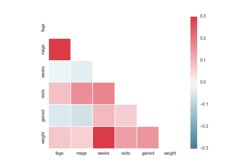
Scatter plot matrix
Multiple numerical variables
In R
pairs(nc[sapply(nc, is.numeric)], data=nc, main="Simple scatterplot Matrix")
In Python
pd.scatter_matrix(data, figsize=(10, 10)) Pandas’ scatter_matrix function plots the histogram on the diagonal.
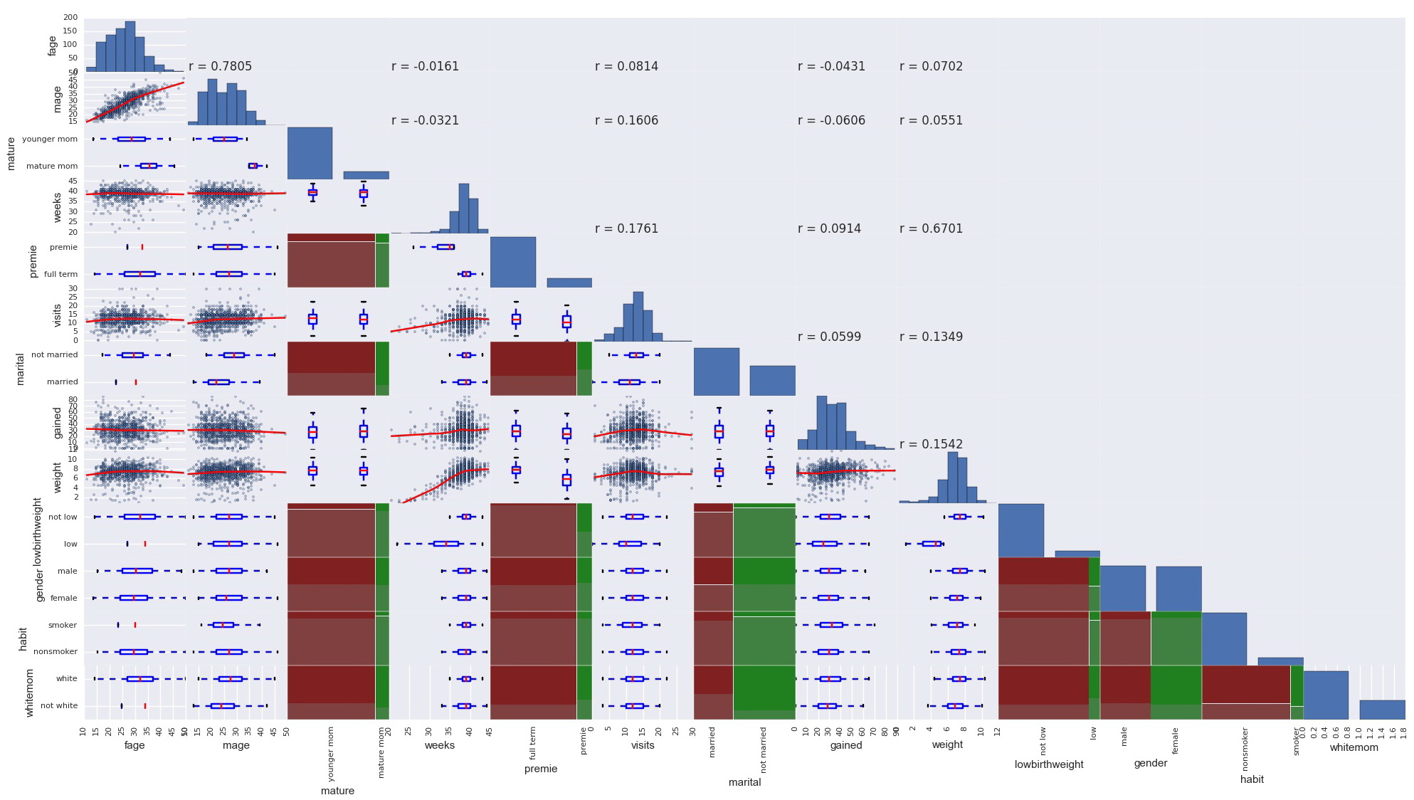
Multiple categorical and numerical variables
In R
Using GGally library ggpairs function, we can plot the relationship of two numerical variables, two categorical variables, and one numerical and one categorical variable. We also have the option to display different types of graph in the upper and lower chart.
library(GGally)
ggpairs(nc, lower=list(continous="points", combo="box", discrete="ratio"), upper=list(continous="cor", combo="box", discrete="ratio"), diag=list(continous="density", discrete="bar"), axisLabels="show", title="GGpairs scatterplot matrix")
In Python
Pandas built in scatter_matrix function prints only the scatterplots for numerical variables, and there is no GGally’s ggpairs equivalent function in Python. I inherited Pandas scatter_matrix function and created a scatter_matrix_all function to plot the relationship of all variables regardless of type.
def scatter_matrix_all(frame, alpha=0.5, figsize=None, grid=False, diagonal='hist', marker='.', density_kwds=None, hist_kwds=None, range_padding=0.05, **kwds):

    import matplotlib as mpl
    import matplotlib.pyplot as plt
    from matplotlib.artist import setp
    import pandas.core.common as com
    from pandas.compat import range, lrange, lmap, map, zip
    from statsmodels.nonparametric.smoothers_lowess import lowess

    df = frame
    num_cols = frame._get_numeric_data().columns.values
    n = df.columns.size
    fig, axes = plt.subplots(nrows=n, ncols=n, figsize=figsize, squeeze=False)

    # no gaps between subplots
    fig.subplots_adjust(wspace=0, hspace=0)

    mask = com.notnull(df)
    marker = _get_marker_compat(marker)

    hist_kwds = hist_kwds or {}
    density_kwds = density_kwds or {}

    # workaround because `c='b'` is hardcoded in matplotlibs scatter method
    kwds.setdefault('c', plt.rcParams['patch.facecolor'])

    boundaries_list = []
    for a in df.columns:
        if a in num_cols:
            values = df[a].values[mask[a].values]
        else:
            values = df[a].value_counts()
        rmin_, rmax_ = np.min(values), np.max(values)
        rdelta_ext = (rmax_ - rmin_) * range_padding / 2.
        boundaries_list.append((rmin_ - rdelta_ext, rmax_+ rdelta_ext))

    for i, a in zip(lrange(n), df.columns):
        for j, b in zip(lrange(n), df.columns):
            ax = axes[i, j]

            if i == j:
                if a in num_cols:    # numerical variable
                    values = df[a].values[mask[a].values]
                    # Deal with the diagonal by drawing a histogram there.
                    if diagonal == 'hist':
                        ax.hist(values, **hist_kwds)
                    elif diagonal in ('kde', 'density'):
                        from scipy.stats import gaussian_kde
                        y = values
                        gkde = gaussian_kde(y)
                        ind = np.linspace(y.min(), y.max(), 1000)
                        ax.plot(ind, gkde.evaluate(ind), **density_kwds)
                    ax.set_xlim(boundaries_list[i])
                else:                # categorical variable
                    values = df[a].value_counts()
                    ax.bar(list(range(df[a].nunique())), values)
            else:
                common = (mask[a] & mask[b]).values
                # two numerical variables
                if a in num_cols and b in num_cols:
                    if i > j:
                        ax.scatter(df[b][common], df[a][common], marker=marker, alpha=alpha, **kwds)
                        # The following 2 lines add the lowess smoothing
                        ys = lowess(df[a][common], df[b][common])
                        ax.plot(ys[:,0], ys[:,1], 'red')
                    else:
                        pearR = df[[a, b]].corr()
                        ax.text(df[b].min(), df[a].min(), 'r = %.4f' % (pearR.iloc[0][1]))
                    ax.set_xlim(boundaries_list[j])
                    ax.set_ylim(boundaries_list[i])
                # two categorical variables
                elif a not in num_cols and b not in num_cols:
                    if i > j:
                        from statsmodels.graphics import mosaicplot
                        mosaicplot.mosaic(df, [b, a], ax, labelizer=lambda k:'')
                # one numerical variable and one categorical variable
                else:
                    if i > j:
                        tol = pd.DataFrame(df[[a, b]])
                        if a in num_cols:
                            label = [ k for k, v in tol.groupby(b) ]
                            values = [ v[a].tolist() for k, v in tol.groupby(b) ]
                            ax.boxplot(values, labels=label)
                        else:
                            label = [ k for k, v in tol.groupby(a) ]
                            values = [ v[b].tolist() for k, v in tol.groupby(a) ]
                            ax.boxplot(values, labels=label, vert=False)

            ax.set_xlabel('')
            ax.set_ylabel('')

            _label_axis(ax, kind='x', label=b, position='bottom', rotate=True)
            _label_axis(ax, kind='y', label=a, position='left')

            if j!= 0:
                ax.yaxis.set_visible(False)
            if i != n-1:
                ax.xaxis.set_visible(False)

    for ax in axes.flat:
        setp(ax.get_xticklabels(), fontsize=8)
        setp(ax.get_yticklabels(), fontsize=8)
    return fig


def _label_axis(ax, kind='x', label='', position='top', ticks=True, rotate=False):
    from matplotlib.artist import setp
    if kind == 'x':
        ax.set_xlabel(label, visible=True)
        ax.xaxis.set_visible(True)
        ax.xaxis.set_ticks_position(position)
        ax.xaxis.set_label_position(position)
        if rotate:
            setp(ax.get_xticklabels(), rotation=90)
    elif kind == 'y':
        ax.yaxis.set_visible(True)
        ax.set_ylabel(label, visible=True)
        #ax.set_ylabel(a)
        ax.yaxis.set_ticks_position(position)
        ax.yaxis.set_label_position(position)
    return

def _get_marker_compat(marker):
    import matplotlib.lines as mlines
    import matplotlib as mpl
    if mpl.__version__ < '1.1.0' and marker == '.':
        return 'o'
    if marker not in mlines.lineMarkers:
        return 'o'
    return marker

scatter_matrix_all(data, alpha=0.4, figsize=(25,25))