Visualizing Paired Data in R and Python Pandas
April 27, 2015
The Data
North Carolina births
In 2004, the state of North Carolina released a large data set containing information on births recorded in this state. This data set is useful to researchers studying the relation between habits and practices of expectant mothers and the birth of their children. We will work with a random sample of observations from this data set.
Read data from URL
In R
download.file('http://www.openintro.org/stat/data/nc.RData', destfile = 'nc.RData')
load('nc.RData')
In Python
import pandas as pd
data = pd.read_csv('http://photo.etangkk.com/python/NCbirths.txt', sep='\t')
Visualizing two numerical variables
Scatterplots
Scatterplot is a good visual picture to identify potential associations between two numerical variables and aids the interpretation of the correlation coefficient or regression model.
In R
plot(x=nc$weeks, y=nc$weight, type="p", main="Weeks of pregnancy vs baby weigh at birth", xlab="Length of pregnancy in weeks", ylab="Weight of the baby at birth in pounds")
Using ggplot2
library(ggplot2)

ggplot(nc, aes(x=weeks, y=weight)) + geom_point() + labs(title="Weeks of pregnancy vs baby weigh at birth", x="Length of pregnancy in weeks", y="Weight of the baby at birth in pounds")
In Python
import matplotlib.pyplot as plt
ax = data.plot(kind='scatter', x='weeks', y='weight')
ax.set_title('Weeks of pregnancy vs baby weight')
ax.set_xlabel('Length of pregnancy in weeks')
ax.set_ylabel('Weight of the baby at birth in pounds')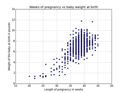
Visualizing two categorical variables
Contingency table or crosstab
Contingency table is a useful tool for examining relationships between categorical cariables, the number displayed give the frequency count of each data point. The number of smoker, nonsmoker, low and not low individuals are called marginal totals, the grand total is the number in the bottom right corner.
In R
table(nc$lowbirthweight, nc$habit, exclude=NULL)##
## nonsmoker smoker <NA>
## low 92 18 1
## not low 781 108 0
## <NA> 0 0 0The entires in the cells can also display the relative frequencies. We use the CrossTable function from the gmodels library to print a nice table showing the frequency count, row proportion and column proportion.
library(gmodels)## Warning: package 'gmodels' was built under R version 3.2.3ctab <- CrossTable(nc$lowbirthweight, nc$habit, prop.t=FALSE, prop.chisq=FALSE)##
##
## Cell Contents
## |-------------------------|
## | N |
## | N / Row Total |
## | N / Col Total |
## |-------------------------|
##
##
## Total Observations in Table: 999
##
##
## | nc$habit
## nc$lowbirthweight | nonsmoker | smoker | Row Total |
## ------------------|-----------|-----------|-----------|
## low | 92 | 18 | 110 |
## | 0.836 | 0.164 | 0.110 |
## | 0.105 | 0.143 | |
## ------------------|-----------|-----------|-----------|
## not low | 781 | 108 | 889 |
## | 0.879 | 0.121 | 0.890 |
## | 0.895 | 0.857 | |
## ------------------|-----------|-----------|-----------|
## Column Total | 873 | 126 | 999 |
## | 0.874 | 0.126 | |
## ------------------|-----------|-----------|-----------|
##
## In Python
print pd.crosstab(data.lowbirthweight, data.habit, margins=True) ## habit nonsmoker smoker All
## lowbirthweight
## low 92 18 111
## not low 781 108 889
## All 873 126 1000The margin sum for low birth weight is 92 + 18 = 110 but the table above is showing 111. Turnout pandas.crosstab dropna parameter only drops columns if their entries are ALL NaN. In our dataset habit contains one NaN value so it just mysteriously disappeared, I’ve hardcoded NaN to string ‘NaN’ to make margin sum and grand total consistent.
print pd.crosstab(data.lowbirthweight, data.habit.replace(np.nan, 'NaN'), margins=True) ## habit NaN nonsmoker smoker All
## lowbirthweight
## low 1 92 18 111
## not low 0 781 108 889
## All 1 873 126 1000Relative frequencies by row (lowbirthweight)
print pd.crosstab(data.lowbirthweight, data.habit).apply(lambda x: x/x.sum(), axis=1) ## habit nonsmoker smoker
## lowbirthweight
## low 0.836364 0.163636
## not low 0.878515 0.121485Relative frequencies by column (habit)
print pd.crosstab(data.lowbirthweight, data.habit).apply(lambda x: x/x.sum(), axis=0) ## habit nonsmoker smoker
## lowbirthweight
## low 0.105384 0.142857
## not low 0.894616 0.857143Segmented (stacked) bar plot
Segmented or stacked bar plot is useful for visualizing conditional frequency distributions; it explores the relationship between the categorical variables when compares their relative frequencies.
In R
par(mfrow=c(1, 3))

ctable <- table(nc$lowbirthweight, nc$habit)
barplot(ctable, main="Segmented bar plot", xlab='habit', ylab='Frequency', col=c("blue", "orange"), legend=rownames(ctable))

barplot(ctable, main="Segmented bar plot", xlab='habit', ylab='Frequency', col=c("blue", "orange"), legend=rownames(ctable), beside=TRUE)

barplot(ctab$prop.col, main="Relative frequency segmented bar plot", xlab='habit', ylab='Proportion', col=c("blue", "orange"), legend=rownames(ctable))
Using ggplot2
p1 <- ggplot(nc[!is.na(nc$habit), ], aes(x=habit, fill=lowbirthweight)) + geom_bar() + labs(title="Segmented bar plot", x='habit', y='Count')

p2 <- ggplot(nc[!is.na(nc$habit), ], aes(x=habit, fill=lowbirthweight)) + geom_bar(position="dodge") + labs(title="Segmented bar plot", x='habit', y='Count')

p3 <- ggplot(nc[!is.na(nc$habit), ], aes(x=habit, fill=lowbirthweight)) + geom_bar(position="fill") + labs(title="Relative frequency segmented bar plot", x='habit', y='Proportion')

library(gridExtra)
grid.arrange(p1, p2, p3, ncol=3, nrow=1)
In Python
ctable = pd.crosstab(data.habit, data.lowbirthweight)
ctab = pd.crosstab(data.habit, data.lowbirthweight).apply(lambda x: x/x.sum(), axis=1)

fig, axes = plt.subplots(nrows=1, ncols=2, figsize=(16,8))
ctable.plot(ax=axes[0], kind='bar', stacked=True, title='Segmented bar plot')
axes[0].set_xlabel('Habit')
axes[0].set_ylabel('Frequency')
axes[0].set_xticklabels(ctable.index, rotation=0)
ctab.plot(ax=axes[1], kind='bar', stacked=True, title='Relative frequency segmented bar plot')
axes[1].set_xlabel('Habit')
axes[1].set_ylabel('Proportion')
axes[1].legend(loc='center', ncol=4, fancybox=True, shadow=False)
axes[1].set_xticklabels(ctable.index, rotation=0) 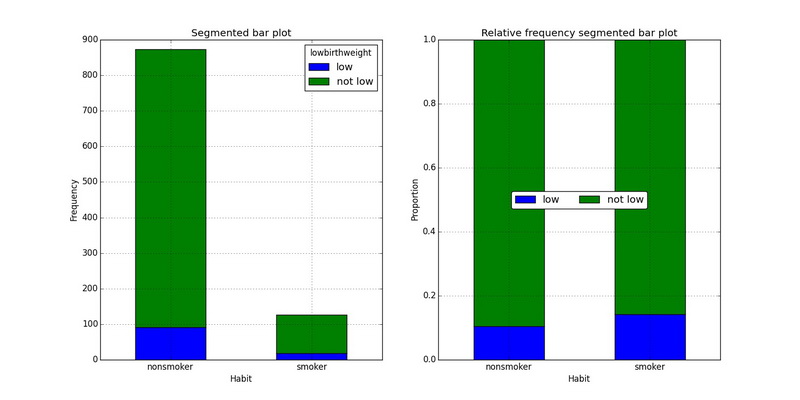
Mosaic plot
Mosaic plot is a square graph which allows easy examination of the relationship among two or more categorical variables.
In R
library(vcd)
mosaic(~ habit + lowbirthweight + gender, data=nc, color=TRUE, legend=FALSE)
In Python
from statsmodels.graphics import mosaicplot
ax = mosaicplot.mosaic(data, ['lowbirthweight', 'habit', 'gender']) 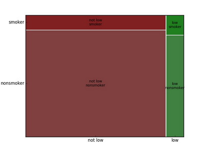
Visualizing a categorical variable and a numerical variable
Stacked histograms / density plot
Stacked histograms and density plot are use to compare distribution of continuous variable for different groups.
In R
par(mfrow=c(1,2))

hist(nc[nc$habit=="nonsmoker", 'weight'], col='skyblue', main="Historgram of weight by habit")
hist(nc[nc$habit=="smoker", 'weight'], add=T, col=scales::alpha('red', .5))

plot(density(nc[nc$habit=="nonsmoker", 'weight'], na.rm=TRUE), col="red", main='Density of weight by habit', xlab='Weight')
lines(density(nc[nc$habit=="smoker", 'weight'], na.rm=TRUE), col="blue")
Using ggplot2
p1 <- ggplot(nc[!is.na(nc$habit), ], aes(x=weight, fill=habit)) + geom_histogram(binwidth=1) + labs(title="Stacking histogram", x='weight', y='Count')

p2 <- ggplot(nc[!is.na(nc$habit), ], aes(x=weight)) + geom_histogram(binwidth=1) + facet_grid(habit ~ .) + labs(title="Stacking histogram", x='weight', y='Count')

p3 <- ggplot(nc[!is.na(nc$habit), ], aes(x=weight, color=habit)) + geom_density() + labs(x='weight', y='habit')

library(gridExtra)
grid.arrange(p1, p2, p3, ncol=3, nrow=1)
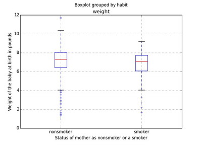
Side-by-side box plots
A side-by-side box plots are useful in comparing fundamental information (outliers, median, and interquartile range IQR) among the factors in categorical variable.
In R
boxplot(weight~habit, data=nc, col=c("orange","yellow"), xlab='Status of mother as nonsmoker or a smoker', ylab='Weight of the baby at birth in pounds', horizontal=FALSE)
Using ggplot2
ggplot(nc[!is.na(nc$habit), ], aes(x=habit, y=weight)) + geom_boxplot() + labs(x='Status of mother as nonsmoker or a smoker', y='Weight of the baby at birth in pounds') + coord_flip()
In Python
ax = data.boxplot(column=['weight'], by=['habit'])
ax.set_xlabel('Status of mother as nonsmoker or a smoker')
ax.set_ylabel('Weight of the baby at birth in pounds')